Matrix
EDF / INTERNAL TOOL
Helping EDF's digital innovation team go from scattered project requests to structured launches, with clearer decisions and less noise.
PARTIES INVOLVED
1 designer, 1 product owner, 1 developer
MY ROLE
User research, design and prototyping, testing and iteration
TIMELINE
November 2023 to September 2024
Context
The Manufacture Digitale is EDF's internal digital innovation team, building tools that help teams work smarter and move faster across the business.
This project started with a real frustration: project requests were coming in through emails, decisions were taking too long, and nobody had a clear view of what was actually being prioritised or why.
The goal was to build a structured intake tool that would make Go/No-Go decisions faster, reduce the noise in how requests were managed, and give the team a shared picture of what they were committing to. Longer term, the ambition was for it to serve as a base product that other EDF digital teams could adapt to their own requirements and operational needs.
Key pain points
BREAKDOWN OF THE PROBLEM
⌛ Slow Go/No-Go decisions
The existing process worked in theory, but decisions were taking too long in practice. Teams needed a way to evaluate and commit to projects faster without losing rigour.
🔄 No clear prioritisation system
There was no structured way to decide which projects came first. The most strategic work wasn't always getting the attention it deserved, and the team had no shared view to align around.
📧 Too much email, not enough clarity
Project requests arrived through scattered emails with no standard format. This created overhead for everyone involved and made it hard to track what was in the pipeline.
🔬 User research
HOW WE LEARNED
The entire research phase was led by me. I structured, facilitated, and reported on the workshops and testing sessions from start to finish. It was one of the first times I owned a research process end to end.
WORKSHOPS
We ran several co-design workshops with the people who would actually be using the tool, getting them involved before any design decisions were made. Two workshops focused on what users needed: what information mattered to them, how they wanted to see it, and what decisions they needed to make at a glance. These gave us the architecture to design around.
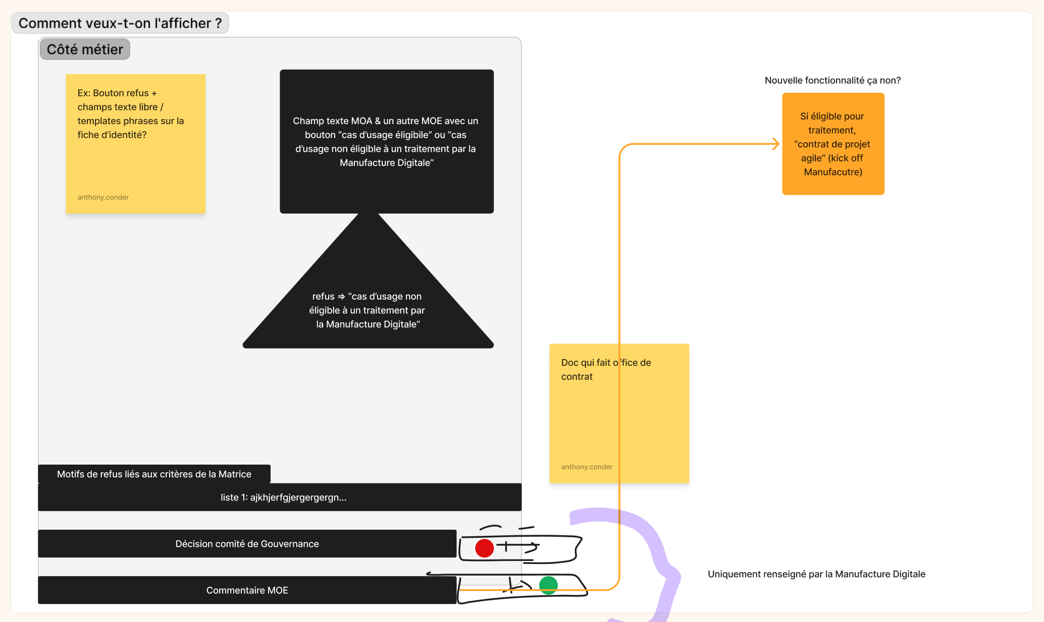
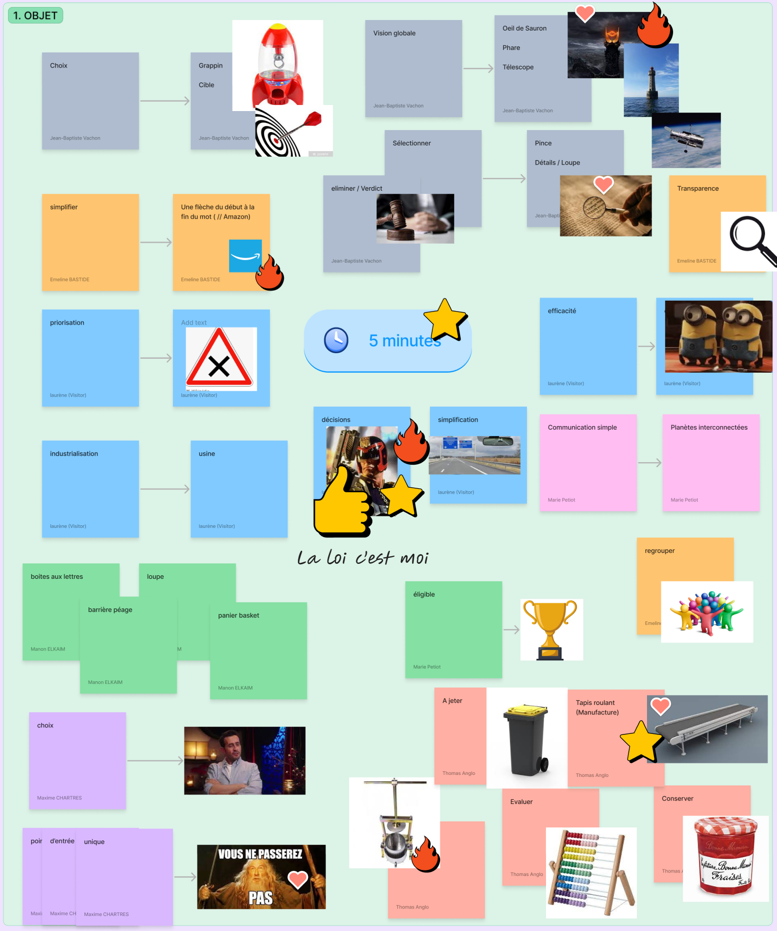
A third workshop focused on branding, using brainstorming, word association exercises, and a dot-voting system to align the team on look and feel. Naming, colour direction, and logo style all came out of that session, shaped directly by the people who would use the product.
USER TESTING
Testing was run with three core users across three predefined scenarios using a Figma prototype. Alongside the sessions, we used a Microsoft Forms survey with a satisfaction scale and sentence completion exercises. Feedback was overall positive, and concrete suggestions from users were documented and fed directly into the next iteration. All findings were compiled into a handoff report for the team to act on after my departure.
🎨 Design
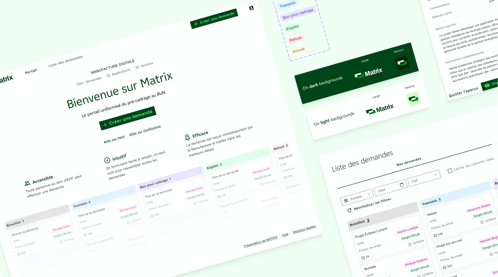
WHAT I BUILT
BENCHMARK
Before touching any UI, I explored how other project management and intake tools handled similar challenges. The goal was to understand what conventions users already had in their heads, not to copy patterns, but to know where there was room to do something more interesting.
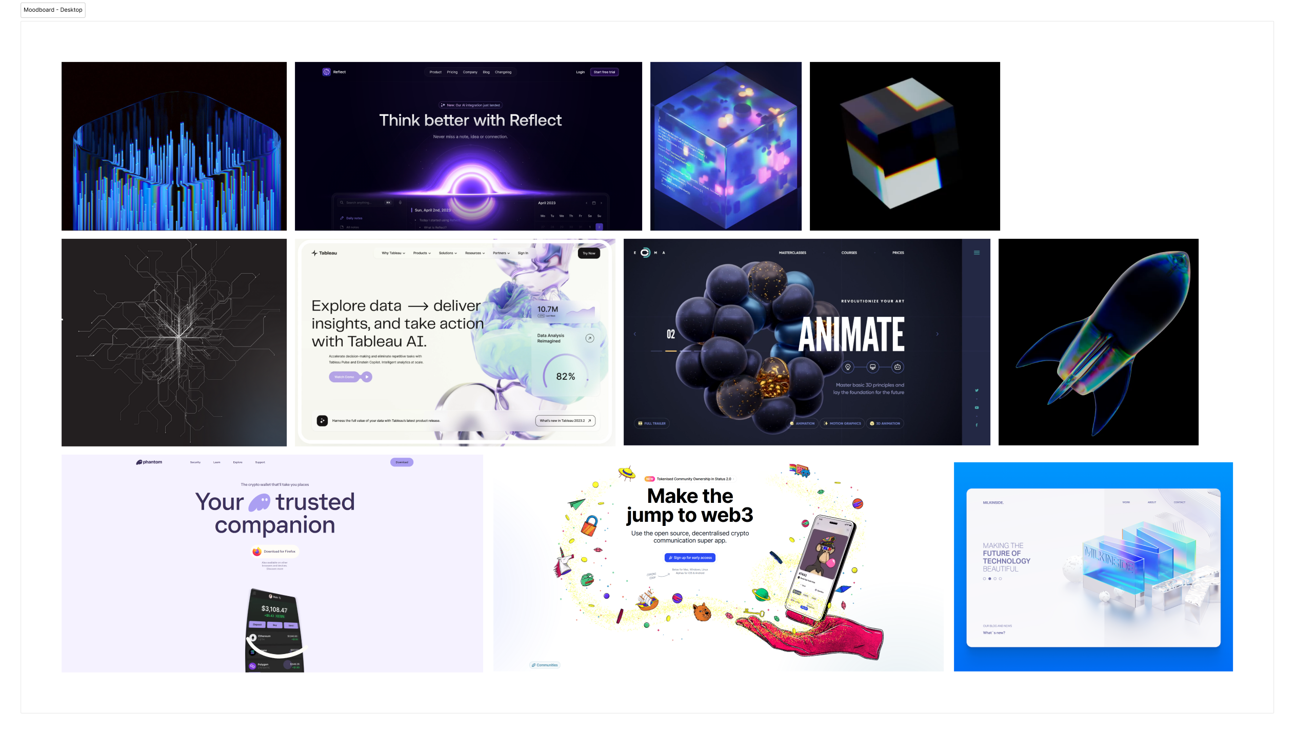
A moodboard helped align the team on a visual direction early, before any decisions about colour, typography, or layout were locked in.
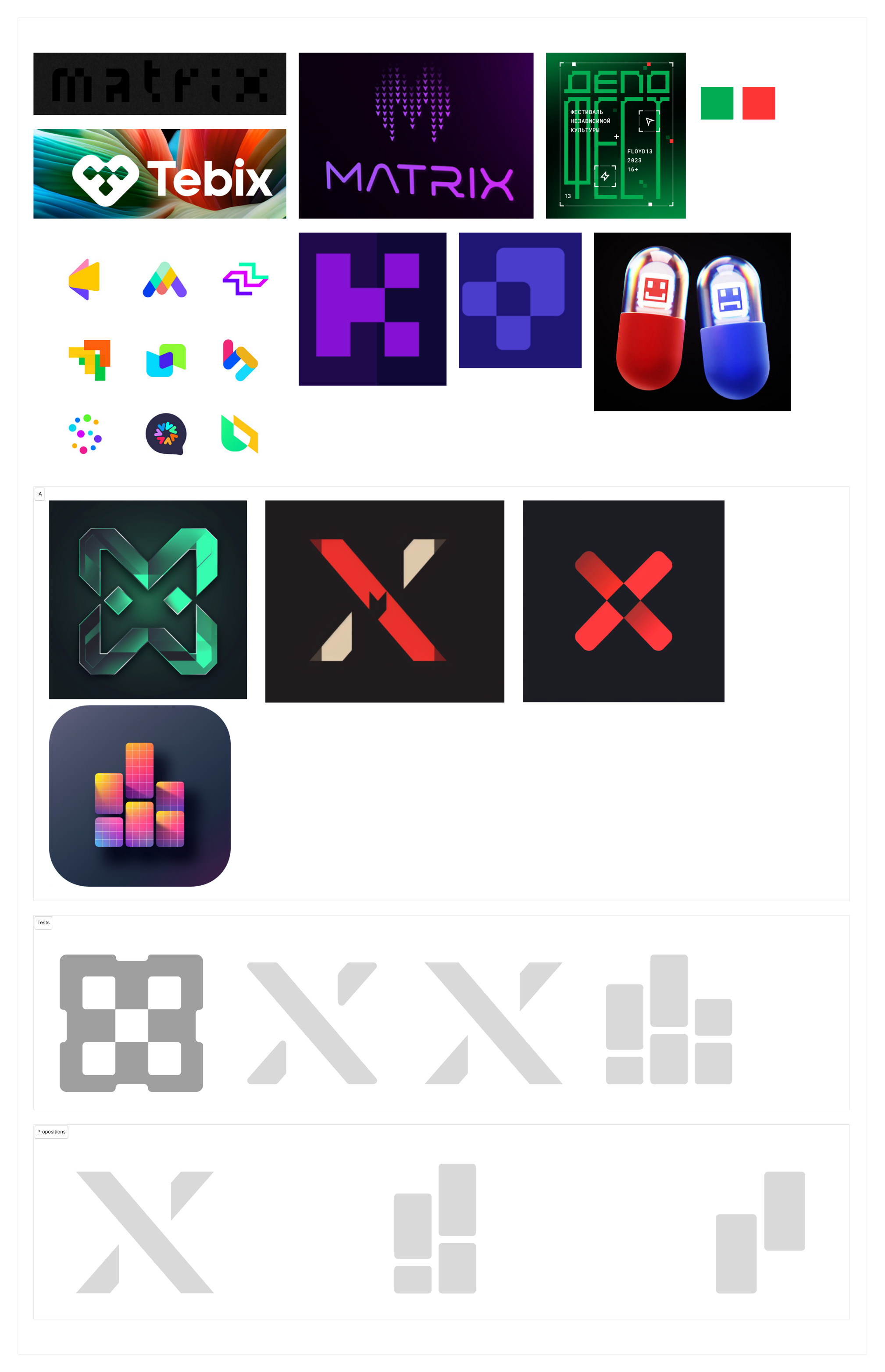
BRANDING
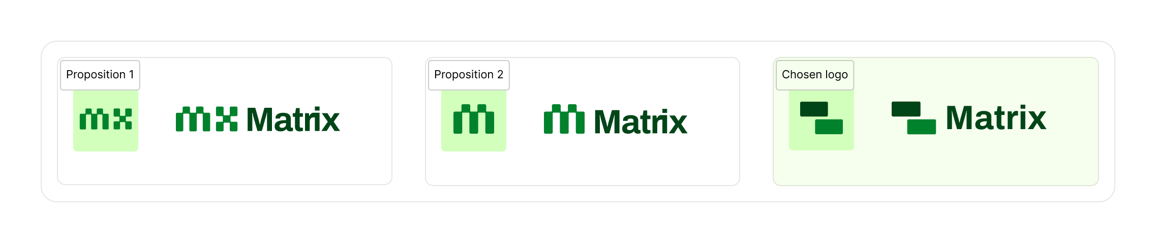
EDF operates a strict internal design system that leaves limited creative room. Despite those constraints, I pushed for a visual identity that felt distinct within the wider EDF ecosystem. Three logo propositions were presented and one was selected and refined into the final identity.
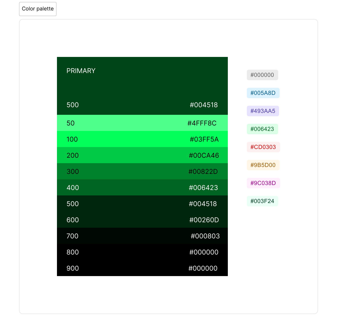
A green-led colour palette was chosen alongside softer supporting tones for components and status indicators. The result was a product that felt noticeably different from the rest of the EDF app landscape while staying within the rules.
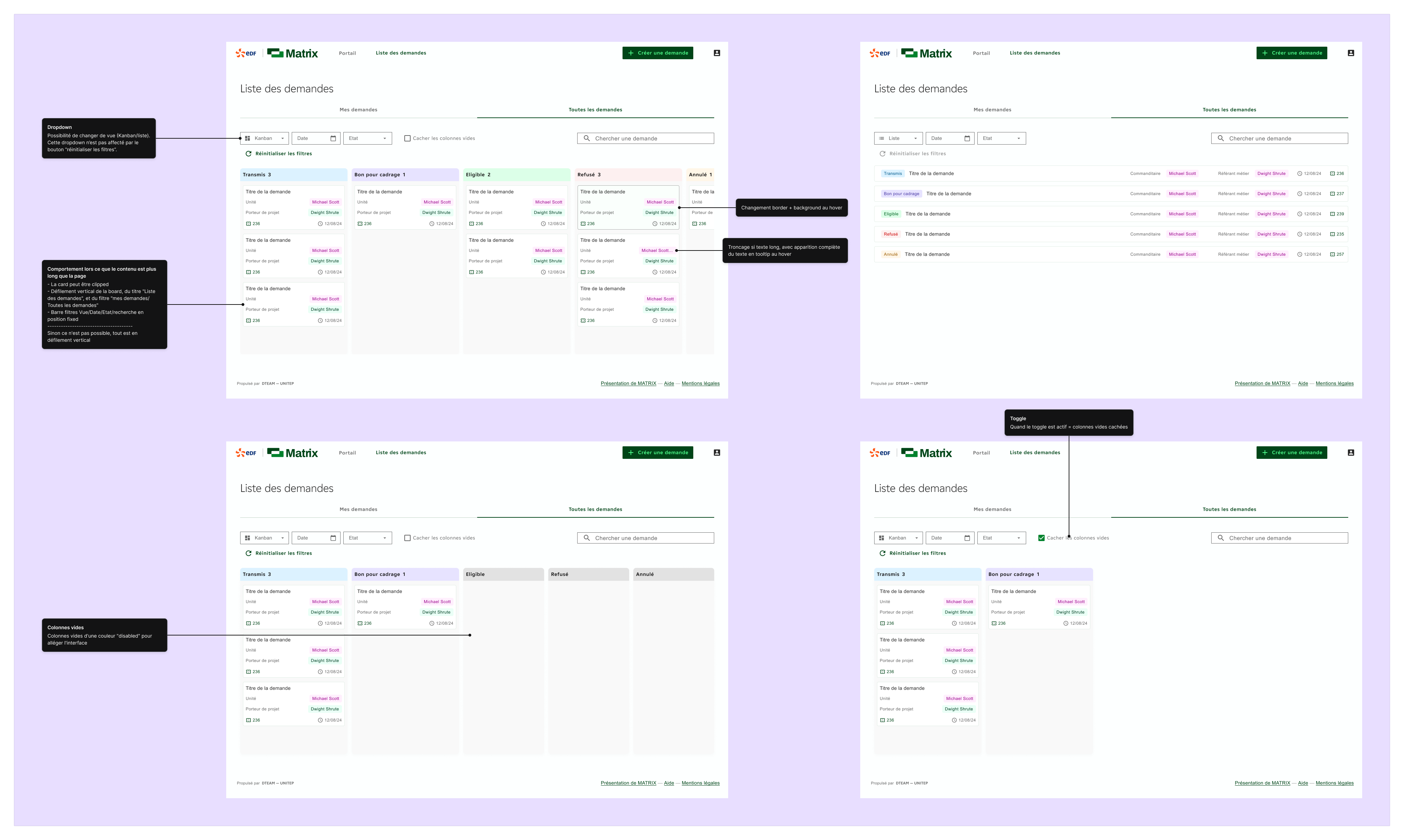
PROTOTYPING
The UI was built around a component library developed in parallel with the product. Each screen was designed to be consistent, reusable, and straightforward to hand off, so the developer could move quickly without interpreting ambiguous specs.
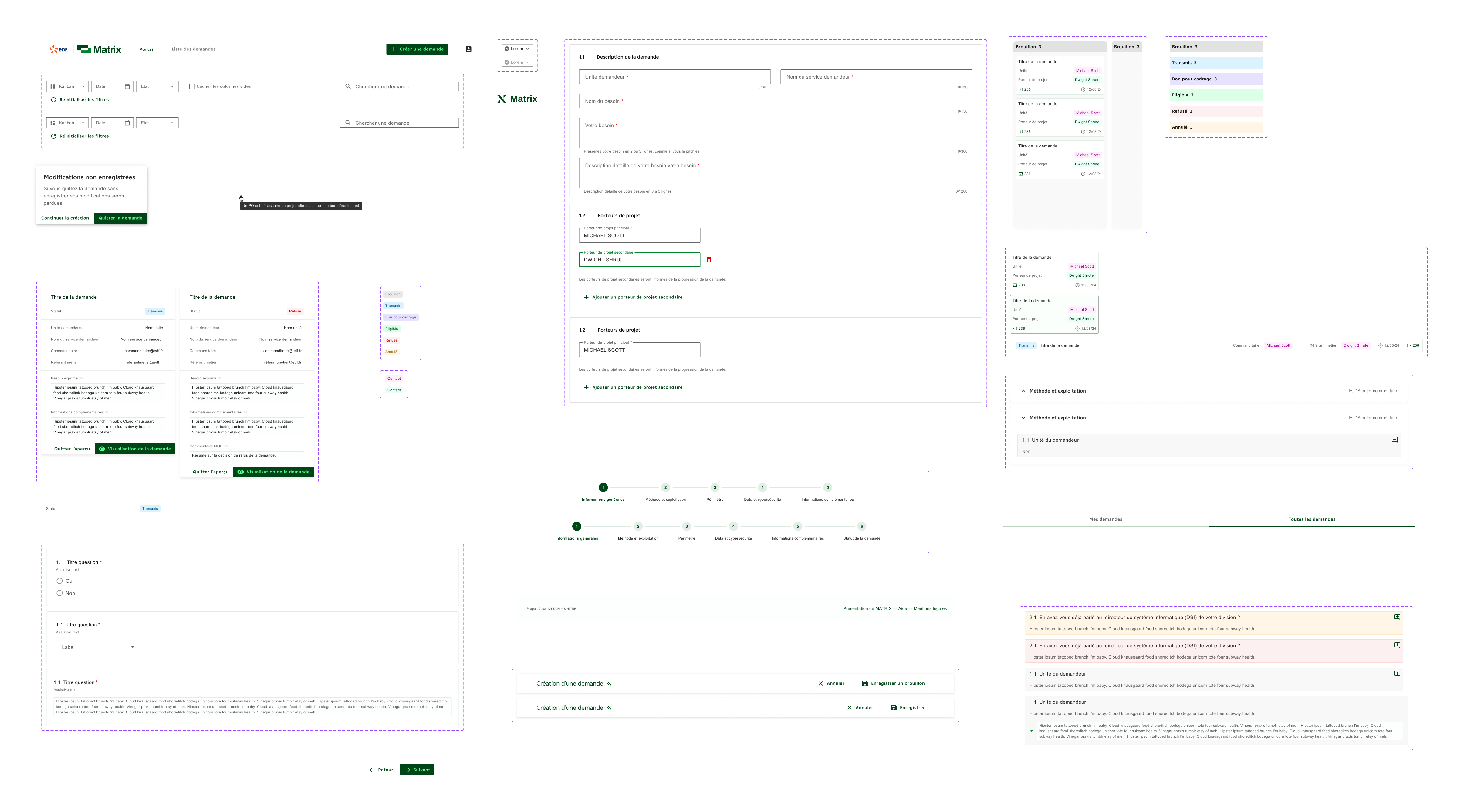
COLLABORATION
Working closely with the product owner and developer from day one meant design decisions stayed grounded in what was actually buildable. We used Figma for specs and Jira for task tracking, which kept everyone aligned and reduced back-and-forth throughout implementation.
Outcomes
WHAT CAME OF IT
✅ Approved for wider adoption
The app was approved by the project manager to be rolled out to additional EDF digital teams, moving beyond its original Manufacture Digitale context.
🔧 Built to be adaptable
The product was designed from the start to serve as a base that other teams could adapt to their own requirements and operational needs, rather than a one-team solution.
📋 Full handoff delivered
Research findings, user feedback, and documentation were compiled and handed off to give the team a clear picture of what worked, what needed iteration, and what to prioritise next.
🎨 A distinct identity within EDF
Despite a restrictive internal design system, the product stood out visually from the wider EDF app ecosystem with its own branding and UI approach.
Final reflection
Matrix was one of my earlier projects, and it taught me a lot about what it actually means to work within constraints. EDF's internal design system left limited creative room, but that limitation pushed me to find differentiation in the details rather than in complete freedom.
Leading the research phase entirely on my own was formative. Structuring workshops, facilitating sessions, running usability tests, and compiling findings into something actionable gave me a process I've carried into every project since.
The ambition for the product to scale beyond one team also shaped how I thought about handoff. Designing something meant to be picked up and adapted by people you'll never meet requires a different level of documentation and structural thinking.